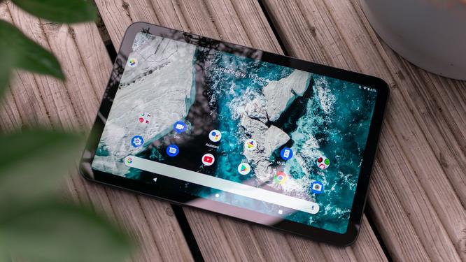
Brightness and contrast are good too. We measured a peak brightness of 440cd/m2, which is par for the course for an IPS panel, and the tablet’s contrast ratio of 1,903:1 is one of the best around – most Android tablets manage around 1,300:1.

We do have one big problem with the T20’s display, however, and that’s to do with colour reproduction. On paper, it does a fine job of accurately rendering colour tones: we measured an average Delta E of 0.67, indicating that any deviations are too subtle for the human eye to discern.
At the same time, though, the screen only covers 74% of the sRGB gamut, which means it simply can’t display the full rainbow of web colours. Indeed, with default settings we found the entire screen looked uncomfortably cold and blue; adjusting the colour balance in the Settings menu gave us more neutral whites, but reds and oranges remained flat and dull. Sadly, you’ll just have to accept that you won’t get warm, vibrant autumn tones out of this display.
7Nokia T20 review: Specs and performance
As is traditional for Nokia devices, the T20 runs a very clean installation of Android 11. The standard Google apps and services are all present and correct, and the front end hasn’t been tweaked in any noticeable way. This is excellent news for businesses – it means you can be confident that your core apps will be available, and you won’t have to worry about support calls from staff battling with an unfamiliar interface.
